Over the course of Art 4 and Art 5 each of you has had the freedom to develop a personal visual voice. Please articulate the stylistic tendencies you’ve adopted, being sure to mention the process, materials, and subjects you have investigated.
0 Comments
1. What specifically have you learned from this project? Don't only think in terms of the work you made, but also through the discussions during critique of others in the class.
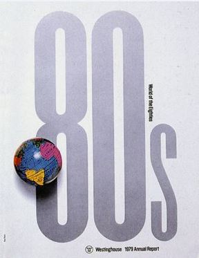
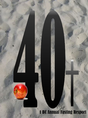
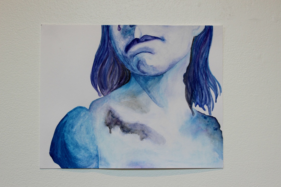
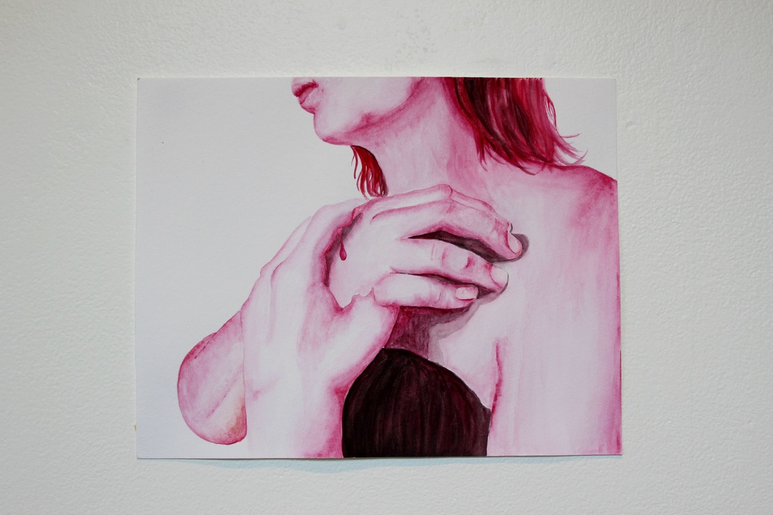
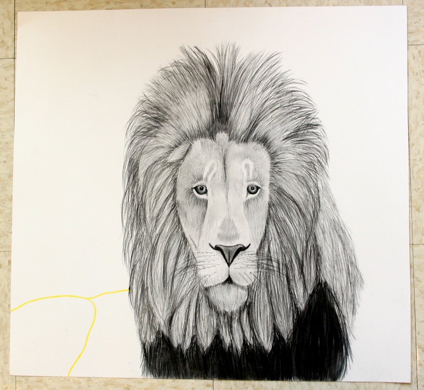
2. If this project is assigned in the future, how might it be tweaked to enhance the overall learning experience for all students? 3. How have your thoughts about design changed through because of this project. 4. What changes would you make if you had the opportunity to re-work the image you created? I recreated Paul Rand's "80's" poster. I was first drawn to the typography and simplistic design that still produced a bold statement. I wanted to bring what meant most to me into it, so I incorporated the story of when Jesus went to the dessert for 40 days to fast. I tried to stay with a similar color scheme in order to have a similar design. I also decided to use Photoshop to construct this so I could branch out from my watercolors and experience a new medium. From this project I learned that a simple design can carry a bold statement. For future assignments I would keep this project fairly similar, but maybe with more structure. I would set it up like the one from Art 3 where we drew our supplies and artist. My thoughts on design stayed fairly similar, but really grew in the time spent looking at different artists and designs. I was very interested in the different approaches that each artist ventured to. If I could rework my image I would figure out how to make the apple flow more, but that is where I really struggled. Overall, I really enjoyed the project and what I got out of it. Finding a voice in my work has always been a struggle of mine until this past summer. Before that, I was just making meaningless work that I had no attachment to, but was always something I knew I had to change. Discovering that voice took time, until realizing that I needed to paint what I was passionate about - and I’m whole heartedly passionate about my love of Christ. This love blossomed into something bigger, but was something that also put me in a vulnerable situation because many don’t associate artists as being Christians. I knew I would be able to overcome this because I started to make some of my best work yet with watercolor. I knew that watercolor was my thing; I have always loved the way the brush flows on the paper and how well colors blend together. I love watching the paint dance and intertwine with each other and how I had complete control over my substance. My process became simple after discovering my voice - photograph my subject, manipulate the flesh with gaps and drips, then paint layers upon layers. This process works for me, and is something that I plan to continue to experiment with during my senior year. 
Recently, my group was assigned to rephrase, rewrite, and mash together our "School of Athens" essays. After a very long class period, we were able to throw something that looked decent to depict and represent the wonderful artwork of Raphael.
The School of Athens was painted by Raphael in 1510 on the walls of St. Peters Basilica—the most important church of its time. It was built by the architect Bramante under the charge of Pope Julius the II. It typifies the Renaissance at its peak, and blends together past and present. Athena and Apollo, two Greek Gods, are featured in the painting. They are painted into the back wall niches as statues and watch over the debating men. This is significant because they are symbols of a pagan religion, and it is ironic to see them on the wall of the leading Catholic Church of the time. Apollo is the God of the sun, male beauty, athleticism, music, and harmony. Apollo represents the renewed emphasis that the Renaissance put on individual human achievement and beauty. The painting of him also references Michelangelo’s sculpture of the Dying Slave. Offsetting Apollo, Athena is the goddess of strategy, wisdom, and the arts. She is a symbol for the powerful Julius II, nicknamed the Warrior Pope, who was the leading force behind the building of St. Peter’s.These symbols of the past represent the rebirth of the qualities of man the embody the Renaissance. In the center of the painting are Plato and Aristotle arguing. Plato is holding his palm to the sky to represent that true knowledge comes from the heavens, and that humans cannot understand it. Aristotle holds his palm towards the earth, to emphasize the material world. Plato is depicted as Leonardo da Vinci, because Raphael thought of da Vinci as an innovative thinker and all around “renaissance man”. By depicting Plato in this way, he establishes Plato and da Vinci as equals, putting the greats of the past and present on the same plane. Many other Renaissance men are referenced in the likenesses of famous Greeks. Similarly he depicts Euclid as Bramante. Euclid was important in his time for his geometric principles and philosophical thoughts. Bramante was the right hand man of Pope Julius II, and was commissioned for the reconstruction of St. Peter’s Basilica. Associating Euclid, a great mind of the past, with Bramante reiterates the humanist theme of “we are as they were”. Furthermore, Michelangelo is painted in as the brooding philosopher, Heraclitus. Heraclitus philosophized that an opportunity lost is an opportunity lost forever, to match the bitterness that Michelangelo knew, because he saw more perfection than he was able to create. Raphael painted himself as speaking Ptolemy, creator of the geocentric theory. Raphael is the only person in the painting who directly looks out of the painting, signifying that he is as important as all of the great minds of the past. This matchup of classical ancients with new Renaissance ideals completely encompasses the overarching philosophy of the time. Humans are the measure of all things. Plato and Aristotle argue about the heavens and the earth, further exemplified in Leonardo da Vinci’s Vitruvian Man. The man stands inside a circle which fits perfectly inside a square. The circle represents the earth, all things that are secular and worldly and what we experience in our lifetimes; the square represents the heavens, the corporeal, and the dreams of the future. These elements of symbolism, the blending of humanism, and the theme of “we are as they were” create a visual summary of the the ideas and movements of the Renaissance. Raphael parallels the minds of the past and innovators of the present to show that the Renaissance mirrors the past greatness while challenges to take perfection to a level above that reached by the minds of antiquity.
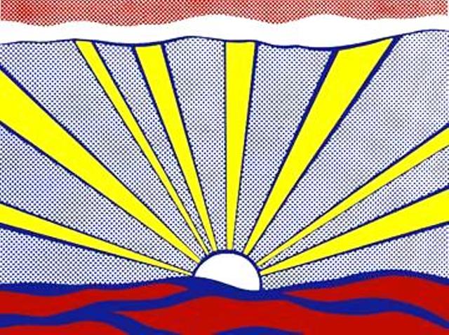 Roy Lichtenstein is the face of the pop art movement, alongside Andy Warhol. He makes realistic things into something it's not, and that's what draws you in. His most famous work was in the time of 1950's to the mid 1960's. More about his work and life is here, http://www.biography.com/people/roy-lichtenstein-9381678
The painting shown, is called "sunrise" because that's exactly what it is. With Lichtenstein he just calls it what he see's it, which makes him different from the others. He doesn't allow others to knock him down, because he knows what he is doing is his own. Bringing in pop art to a culture that has always been strictly classical, was not an easy task. But Lichtenstein was able to do it on his own, and that's what makes him unique. 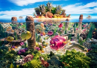 Carl Warner, a new and upcoming artist. But he doesn’t use paint to express himself, he uses food. He creates “foodscapes”, with the one and only medium of food. Here is the website of the man of the hour, going into details of how, and why he does this crazy task. http://www.carlwarner.com/
Warner isn't part of an artist movement, and isn't exactly going to be... His work is his own, and even though there are those who choose the copy him, he is his own work. He started about 15 years ago when he was taking pictures for food companies, and his work has blossomed into something way bigger. The reason that I enjoy his work so much, is because of its diverseness. You will never see anything like this flipping through the pages of an art magazine. When I look at his work, it looks too cool to be true; but you find yourself staring at it for longer than you should, trying to bring it all in that the sense of it's realism. |
Sabrina PorrataDeep Run // Senior // Art V Archives
January 2016
Categories |


 RSS Feed
